Friday, January 22, 2010

Week 18: Styrofoam pop art printing


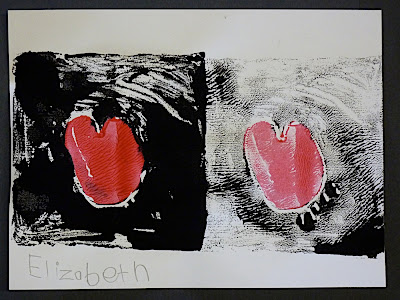
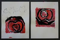
I really like to introduce new concepts, and printmaking is one of those really cool, but sometimes hard concept with youngsters—eventhough, little kids are always "making prints" in their daily lives. As a background in simple graphic forms and printmaking, I decided to talk a bit about Pop Art, Andy Warhol and  Keith Haring.  I showed Haring's red heart series and Warhol's Marilyn Monroe painting. The Haring heart was a great example of simple, two colors and line work mixed with block color. The Warhol was good for the concept of multiple editions of one image.


The hard part is finding a suitable "plate" for having the kids "take away" material that will then print white. Wood, lino and other true printing supplies are expensive, and dangerous for the kids, so I figured I needed a material that was pliable that they could "carve" with apencil or brush handle, with no sharp items needed.  I thought of foam core, but quickly decided on a bunch of square foam takeaway food contaniners, that I cut down to 6 inch squares. The kids could then just use a pencil to make lines and dots in the thin foam.

As for ink, you can use offical printmaking ink and brayers and inking trays etc, but who has time or energy for that with 12 kinders and 30 minutes?  So I had to use what I had on hand: Crayola markers and poster paint.  Don't laugh, but the markers do a decent job, especially if you get a good color that will bead up on the foam and if you really press the print to soak up the marker. I used the markers as a "warmup" while I finished getting the paint ready. Marker is also less messy while they experiment.  But it tends to work better for smaller stamps and more graphic images.

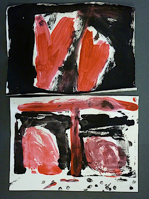
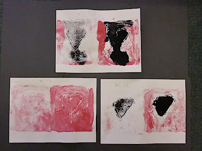
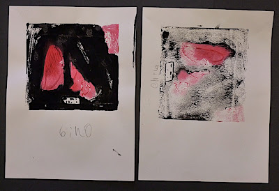
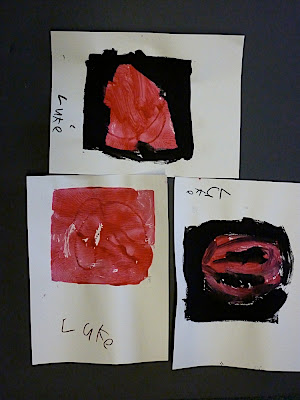
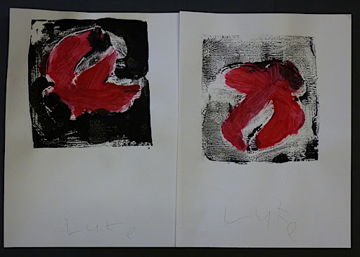
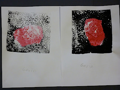
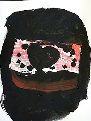
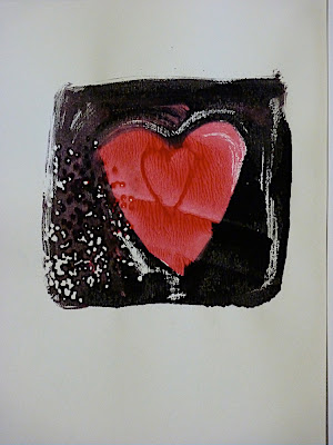
Another lesson I learned was the fewer the colors the better. One color would be great, but with my background in newspaper design, I knew red and black are two great complimentary colors for printing. They also make nice Valentine-themed works.  Since I did this with the 3-4th grade first, they tended to make more complicated images and wanted to use multiple colors, which often made them feel frustrated by the limitations of styrofoam printing. Ironically the K-2nd graders did not question my limited colors and were less judgemental of their work. In the end, I think they ended up happier with the results.

The best images tended to be the simplest, with some texture and freedom.  I am really proud of the true fine art that these kids produced!!

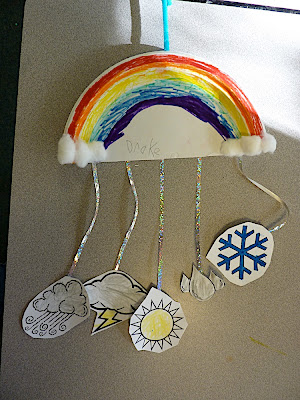
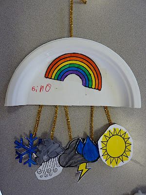
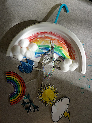
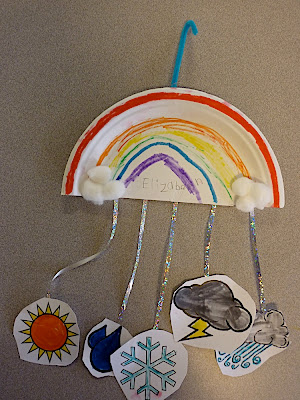
KINDERGARTEN, FIRST,  SECOND GRADERS:


Wednesday, January 13, 2010

Week 17: Weather mobiles


With the K-2nd graders I did something related to weather. Coincidently, the weather this day was actually quite variable: one minute it was sunny, the next it was raining, foggy or cold, and then several rainbows popped up.  Nice inspiration for the youngsters!


I had struggled with how exactly to rig the mobiles, with thoughts turning to wire coat hangers at first. But I turned to the old friend of the kinder-crafter...the paper plate;-)  I initially thought of having the paper plate flat with the items hanging down from around the outside, but I was inspired by the rainbow to cut the plates in half and have the weather icons hang from the flat side.


This allowed me to have the rainbow take center stage and teach the kids the order of colors in a rainbow: Red at top, orange, yellow, green, blue (actually indigo) and then purple (officially violet). We discussed weather and the colors and that got the kids talking and thinking.


To speed things, I compiled a sheet of weather icons for the kids to color/decorate and then cut. I printed these on heavier card stock.  They then had the choice or ribbon, yarn or pipe cleaners to hang these different items. Most chose a really blingy silver sparkle ribbon or pipe cleaners.


For this age group, this kind of color/cut/assemble project is amazingly effective, even if it is not incredibly creative. It is good for concentration and coordination.

Week 17: Warm, Cool, Foreground, Background


This week with the  3rd and 4th graders I did a oil/chalk pastel project.  My instructions included explaining a bit about warm and cool colors and having them use those shades to make a make-believe landscape, utilizing foreground in one color range and a background in the other.

My examples were a warm sunset sky with cool foreground hills, or a night sky with warm foreground.  I had them use black paper for dramatic effect.


Many kids decided to be a bit more illustrative and draw other elements, but many ended up with some interesting abstract looking images.

Wednesday, January 6, 2010

Week 16: Picasso Musicians

I try to introduce several famous artists to the kids and I have already used Van Gogh as an inspiration and will use Eric Carle (of kid's book fame) and George O'Keefe later this spring. This week I used Picasso as inspiration. Namely his "Three Musicians" painting which is a great Abstract but also fun theme for the kids.


Instead of paint I had the kids use scraps of colored paper, which we have a special box for in the art closet.  No full sheets of construction paper were harmed in this lesson, which is great because sometimes the kids want one tiny piece of yellow and grab a whole sheet.  Plus having the odd scraps made them think a bit more "out of the box."  Ironically the more you think about trying to make a person  out of the scraps, the harder it is. When doing the sample, I found it worked to just wing it for best results. Also, the younger kids had an easier time since they were less goal-oriented and perfectionists, compared to the older kids.

As a finishing touch, I has some leftover shiny wrapping paper and some very nice ribbon with music notes that helped add a festive whimsical note to the work.